If you follow our b-nova blog, you have probably already seen that there is a to-do list tutorial for Angular and one for Vue.js. Therefore, we would like to suggest a tutorial with React as a comparison option. If you already have basic experience with React, you can start right away, otherwise we recommend the article Basics with React.
The setup for this to-do list is the one that is made available via create-react-app. Once this is installed, you can create your app as follows:
|
|
You can then open VS Code with code . and start the server with npm start.
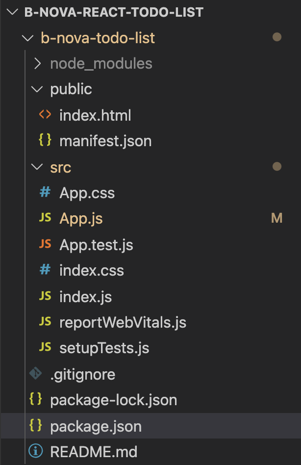
You can also delete all files so that you only have the following folder structure.
You can also remove the entire content of the render method in the App.js file.
It is also only necessary to have a valid HTML structure for one page in the index.html file, as well as a div with the ID root.
The list
As the first component you can create the ToDoList.jsx.
This should represent all ToDoItems in a list.
We use a functions component for all of our components.
|
|
The properties toDoItems should later correspond to the items that are transferred to the list.
ToDoItems should have a certain structure, this is fixed with the help of PropTypes.
Another advantage is that you can determine what type an attribute should have and whether it has to be present or not.
In order to be able to use PropTypes, this package must be installed via the terminal.
|
|
After the installation you can import PropTypes within your components.
In this example this is first done within ToDoList.jsx.
|
|
Add the desired structure between the last curly bracket and the export of the component.
|
|
The next component, Item, is called based on this property. You can create these in the next step.
The item
For the item component you first need properties for the ID, the content and a boolean value, whether this item has already been completed or not.
It is also recommended determining this using PropTypes.
|
|
You have now created the necessary components to be able to display something, but the components have not yet been used within the application and do not yet have any sample data.
Therefore you should now create data for the initial state, which have the attributes id, content and complete.
|
|
You must then import the component ToDoList within the App.js.
|
|
This means that you can now use the component and also transfer the desired properties to it. Your sample data should now be displayed as a list in your browser.
|
|
input field and button
The last component that you still need is an input field and a button to be able to add further items.
In this example this component is called AddToDoForm.jsx.
|
|
As soon as the component has been created, it can be imported and used within the App.js.
|
|
You have now successfully completed the basic structure of your ToDo list. Now you can start to implement the functionality.
Local Storage
For this application we want to use LocalStorage this time to save the ToDo items.
This means that your items are still available after a page reload.
To do this, we recommend creating a service folder and a Service.js class.
You need two methods, one for reading out and one for saving the items.
read out
First you create a method that uses the transferred key to check within LocalStorage whether such a key-value pair is available. If such a key-value pair is available, a JavaScript object is created from this JSON text and returned. If not, a new array is created and returned empty.
|
|
Save
Compared to the readout method, this method is very short. This accepts the key as well as the value which is to be saved to match the key.
|
|
You will need these two service methods in the course of this tutorial within the app component. Therefore you have to import them there. In addition, it will also be necessary to import useState for the next step.
|
|
You can then use this method.
To do this, you create a variable and a setter method that uses the state.
Either the array from the getToDoItemsFromLocalStorage method or an empty array is transferred to the state.
|
|
This variable can now also be passed to the ToDoItems component instead of the items array, which had contained sample data.
|
|
Adding items
Since you no longer get any items displayed, you now have to implement the functionality to add new and your own items.
Therefore you now create a function in App.js that does this.
You use the hook useCallback.
This enables you to use this function further down in your component.
|
|
You must now transfer this function to the AddToDoForm component.
|
|
So that you can also be sure that your component is given the correct properties, you use PropTypes to determine that this property must be a function,
|
|
Within the return value you now have to implement a few things that you have defined here.
|
|
Starting with the variable for the input field.
This is supposed to contain the text for your to-do list item.
Therefore you have to add this using useState and a Setter method.
|
|
The onChange function should be executed every time a onChange event is triggered by the input field.
So if the content of this field changes.
The previously created variable inputValue is changed using the setter method based on the content of the event target.
|
|
Since it is now possible for you to change the value of the input field, you can implement the actual function for adding in the next step.
This method is called based on the onSubmit event, for example as soon as the button is clicked.
First the standard behavior of Submit is prevented and an item object is created.
The ID is made possible by importing uuid.
|
|
If you have not yet installed this, you can do this quickly via the terminal.
|
|
The content is determined using the variable inputValue.
For the standard state of an item, it makes sense to specify that it has not yet been executed.
|
|
Deleting items
Another important function is to be able to delete items from the list.
Therefore we create a handleOnDelete function as before in the App.js.
This also uses the useCallback hook again.
The deletion is carried out using the ID, for this purpose a new array is created using filter with all item IDs that are not the same as the parameter.
The state is then updated with the new array.
The LocalStorage is also updated with the service method.
|
|
This method must now be executed when the event onDeleteToDo is triggered.
|
|
As seen before, this must also be added and defined in the PropTypes of ToDoList.
|
|
This function must also be taken over within the parameters, since this function is to be transferred again to a component below, i.e. the item.
|
|
Since the item component now has the function onDeleteToDo as a property, this must also be adopted as PropType within this component.
|
|
For the functionality that an item can be deleted, the item needs an additional button that does this.
This button should call a handleOnDelete method within the item component.
|
|
This handleOnDelete function in turn uses the useCallback hook.
Of course, it must first be imported again for this component.
This function in turn calls the onDeleteToDo function, which is made available via the properties.
The parameter for this function is the item ID.
|
|
This enables you to delete added items again.
Check off items
When you use a to-do list, you want to see your progress, the things you’ve already done.
We also start with this functionality in the top component App.js.
In this function, filter is not used, but in this case you are looking for a very specific item in order to set the Boolean value by clicking on the opposite value. The item is searched for using the ID. Here, too, the local state and the LocalStorage must be updated at the end.
|
|
As soon as this function is written, you can pass it to the component ToDoList.
|
|
Within ToDoList you now have to adjust three little things:
- Accept onToggle as a parameter
|
|
- pass the item also to this function
|
|
- extend the PropTypes by onToggle
|
|
Now we come to the last component, which you have to expand for this functionality.
In doing so, textDecoration is added to the p element, depending on the value of complete.
A onClick event is also added.
This event calls the function handleOnToggle.
|
|
Since you want to use onToggle, this function is also added to the parameter list.
You can then implement the previously determined handleOnToggle function.
As soon as this is called, onToggle is called again, which is reached up to the top in the App.js.
|
|
Finally, you shouldn’t forget to expand the PropTypes again.
|
|
The styling
Finally, you will definitely want to make some style adjustments so that your to-do list looks like something. We use the CSS-in-JS variant for this. For this it is necessary that you have installed styled-components.
|
|
In every component in which styled-componentes is to be used, you must first carry out an import.
|
|
The item
Inside the component you now have to replace the usual HTML tags with your own styled tags. First a variable name must be determined for this. After the equal sign, you use the import to specify what kind of HTML element you want to be. You can now specify your desired design within single quotation marks. You can use the usual CSS attributes for this.
|
|
Now that you have created your own HTML elements, you can use them within the return value
|
|
The list
Proceed in the same way for the list as described above. First the import statement and then you can determine your design.
|
|
And below again replace the new element for the div element.
|
|
The form
And last but not least, all you have to do is style the form and the button.
|
|
And of course replace the last HTML elements with the new ones.
|
|
Congratulations, you have just implemented your own to-do list with React!
Now you had the opportunity with us to create a to-do list with three different frameworks.
This text was automatically translated with our golang markdown translator.