Another FE framework?
No - Svelte (or Svelte JS) is not a classic framework like Angular, React or VueJs, Svelte is an open source JavaScript compiler which converts declarative code into vanilla JavaScript.
Svelte itself provides the classic possibilities of a JavaScript framework such as declarative templates including loops, if-clauses etc. in a very simple syntax. Other frameworks, for example Angular, deliver a lot of functionalities and polyfills (the runtime of the frameworks) to the browser. The actual resolution of the framework’s own functions takes place in the browser. This means that the browser must first be ’taught’ the framework. The complete runtime framework is therefore required to start and use the application.
Svelte, on the other hand, dissolves all in-house functions during compile time and provides the browser with a fully understandable vanilla JavaScript. This bundle therefore only contains the functions of the application that are actually required.
This can be seen at a glance in the following graphic.
The blue colored K components are self-developed building blocks of the application. The framework (rot) or the F functions in green are the respective building blocks, helpers and core functionalities of the framework or of Svelte.
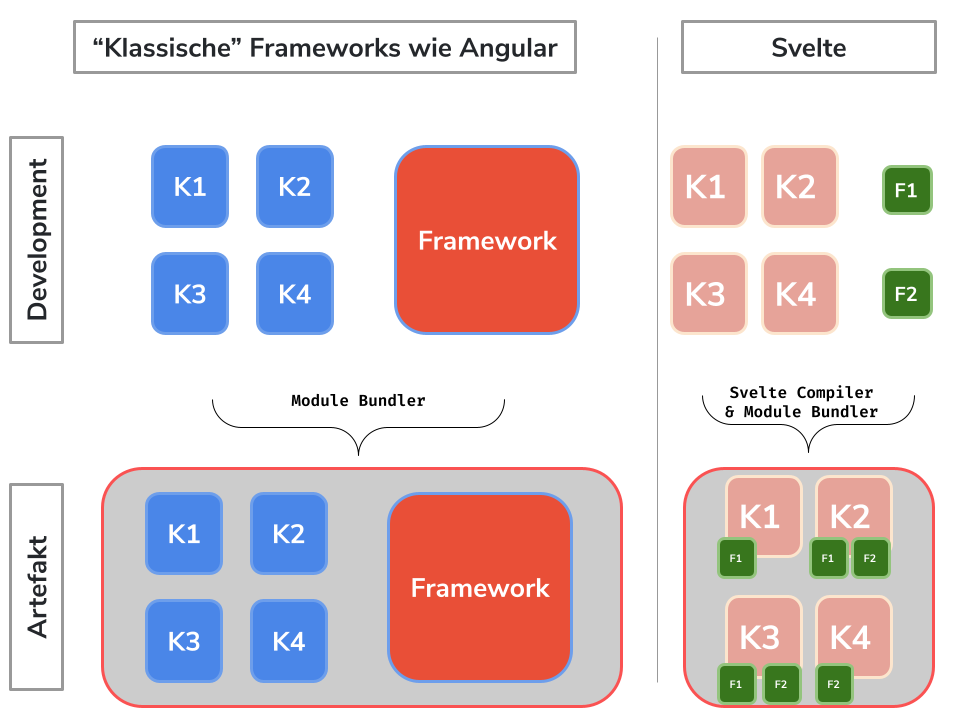
If you compare both types, it quickly becomes apparent that with a classic framework like Angular, the entire framework, including all functions that are not required or used, is packed into the artifact. With Svelte, on the other hand, the compiler ensures that only required functions are packed and the instructions are directly understandable and can be executed without additional runtime.
advantages & disadvantages
One of the biggest advantages of Svelte is obvious, it is not a heavy and extensive framework, so the artifact is very lightweight and can be interpreted by any browser (because it generates vanilla JS). If you take a closer look at this advantage, you quickly notice that Svelte does not use a virtual DOM and thus gains a lot in performance. With a virtual dom, declarative instructions are converted by the browser on DOM instructions and then applied after diffing a virtual dom. This results in the browser having a lot to do!
Svelte, on the other hand, converts the components into imperative code at build time, which “surgically” updates individual parts of the DOM (Real Dom). On one hand, this saves a lot on the bundle size, since only the functions that are actually required are packed and not the entire ‘framework overhead’. On the other hand, you save an enormous amount of loading time and overall performance in the browser, the code is directly understandable and the instructions can be used without diffing, converting or the like. In all benchmarks tests, Svelte is at the top in all topics such as bundle sizes, performance, startup time, build time, time to first screen, etc.
Another advantage is the very lean syntax of Svelte, for example compared to React or VueJS.
There is no obvious disadvantage, it is important to mention that there is no big company behind Svelte, but a large and active community.
What does a Svelte project consist of?
- rollup.config.js - Module Bundler similar to Webpack, Config File for it
- package.json - NPM config with dependencies and build instructions
- src / main.js - Javascript entry point of the application
- src / App.svelte - Svelte entry point
In the ‘public’ folder you can find global CSS styles as well as the generated files bundle.js and bundle.css. If you add the index.html to it, the finished Svelte project is located under public. But here you won’t find any Svelte syntax or commands anymore because everything was compiled according to vanilla Html, CSS and JavaScript.
In general, Svelte also offers support for TypeScript and CSS Pre Processor such as SCSS.
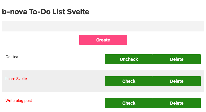
Svelte To-Do List
As in the other TechUps of the frontend series, we want to implement a to-do list together and get to know Svelte.
To start a new project, Svelte offers a template which can be downloaded with the following command. Then we switch to this folder, install the dependencies and start the dev server.
|
|
It’s that fast, our Svelte project is ready and we see the ‘Hello World’ sample page under http://localhost:5000/.
First you want to install a VS Code Svelte plugin and open the project.
|
|
Now we want to create and display our first to-do items, for this we adapt all three parts of a Svelte component:
<script>- contains the logic of the component in JavaScript or TypeScript (can be configured, officially supported) including variable definitions etc.- Html block - contains the markup of the component
<style>- contains the styling of the component, only affects this component
The App.svelte now looks like this.
|
|
The first own component
In the next step we want to implement our own To-Do component and a button to tick off a To-Do item.
For this we create a file under /src with the name ToDo.svelte and copy the paragraph tag and the complete style block.
In addition, we have to define that the variable toDo is set when the component is called, for this we use the keyword export.
|
|
Now we adapt the App.svelte component accordingly by first deleting the style block completely.
Then we want to include our ToDo component once for each item in the Each-Loop.
To do this, we must first import the component and then call or integrate it accordingly with the to-do parameter.
|
|
Next, we want to expand our to-do list with a little more functions, a to-do item should be able to be marked as done or open and it should be able to be deleted.
For this we adapt our ToDo.svelte component and implement two buttons with click handler methods.
In Svelte we can use the on: syntax to access any browser event such as B. Click bind a method.
Our script and html blog now looks like this:
|
|
The check and uncheck functionality is completely implemented.
As can be seen in the example, methods can be declared once as normal Function or in Arrow Syntax.
Event dispatching
When deleting an To-Do item, we have to give an event to the outside world that this item should be deleted.
The reason for this is that the definition and “storage” of the to-do list is located in the App.svelte component; this component must be informed about the deletion.
Svelte offers a very simple possibility for this, we can generate an event dispatcher with the method createEventDispatcher and use it to send custom events.
|
|
We can then bind our deleteToDo event to a method wherever the To Do component is integrated.
We also use the keyword on: for this, analogous to the click binding:
|
|
In the deleteToDo method we can access the body of the event via event.detail and thus delete the element from the list.
It is important here that we reassign the entire list to the variable.
Add a new to do item
Last but not least, we want to implement the creation of a new To Do item in a separate component.
For this we create a new file under / src with the name CreateToDo.svelte and implement an input field including a save button.
Here, too, Svelte offers a simple function to link a variable to an input field, specifically we use bind for this.
This is a two-way binding, so after creating the To Dos we can empty the variable and thus the text field again.
|
|
Now we just have to integrate the new component in the App.svelte, as in the previous steps, and handle the event accordingly.
|
|
Now this function has also been fully implemented and the first version of our b-nova To Do list is ready in Svelte.
styling
When it comes to styling, Svelte generally offers us two options, component-specific or general styles.
First we want to specify styles for the input field and the buttons global, we do this in /public/global.css by adding the following code to the end:
|
|
Then we want to define a separate style for our To Do component by adding a style block at the end.
|
|
As we can see directly on the page, the styles have been correctly applied and the overwriting of the CSS rules in the ToDo.svelte component only counts for this component:
Generate first artifact
A finished artifact can be generated with the following command and is stored in the folder /public.
|
|
And our first Svelte project is done! 😀
Conclusion & Outlook
We have now implemented a complete To Do in Svelte, tasks can be displayed, created, checked off and deleted.
Now we can say - that Svelte is great for small projects, single page applications or micro frontends!
If the project structure becomes larger and more complex, different pages are required including security on roles or logins, etc., Svelte does not seem 100% suitable at first glance. Here z. B. Angular rather correspond to the wishes and requirements.
We at b-nova have migrated the first internal application to Svelte in a very short time and with little effort!
Of course, this TechUp can also be found on GitHub .
In one of the next TechUps we want to take a closer look at the SvelteKit extension, examine the differences and advantages in more detail and try to find the real life use case.
Do you need a slim micro front end with interfaces to scalable microservices in the back end? Contact us!
This text was automatically translated with our golang markdown translator.